
T-Rex Tickets

View Prototype
The Event
General Assembly x Octagon Hackathon
Participating Teams: 8
Timeline: 4 days
Tools: Figma, Miro, Zoom, Google Suite
My Team
Myself - UX Designer
Peter Hsiao - UX Designer
Jordan Weiss - Data Scientist
Scott Griffith - Front End Developer
Andrew Hsu - Back End Developer
Goals
A full-stack app
Methods
User Research | User Interviews | Persona Development | User Journey Mapping | Problem Statement | Feature Prioritization (MoSCoW Map) | Task Flows | Sketching | Wireframing | Prototyping | Usability Testing
The Challenge
In the era of COVID, events companies like Octagon must think of creative solutions that allow consumers to safely attend live concerts, sports games, etc. This includes the process wherein consumers arrive on site and show their ticket to enter. Hackathon participants should find a contactless, safe way for consumers to “check-in” on site at events.

Normally, the process of designing and building a product starts with UX research, designing and testing, after which UX hands the project off to developers who build the product out. Due to the condensed nature of this hackathon (less than 1 week), our team of designers, devs, and data scientists decided to change up the order of operations, in order to optimize our time and resources.
As a group, we spent time ideating on a base idea for our product, which would fit within our shortened scope. We ultimately hypothesized that we should build an app that produced QR codes, which would act as tickets. Users could then hold their phone up to a reader when arriving on site, and be checked in without ever having to come into contact with another person.
With this in mind, our team split into our respective departments and got to work.

Phase 1: Research & Synthesis
Though our team had an initial idea for how we would solve Octagon’s problem, the UX portion of the team wanted to talk to users to verify that the idea of QR codes would be helpful to them. We also wanted to hear more from people about how an app could help them with the check-in process, so we could add additional features to make the product useful in multiple ways.

We interviewed 8 users about their past experiences with attending ticketed events, both using electronic and physical tickets

Using an Affinity Map, we synthesized our data and identified trends in our users’ experiences
Based on the main themes in our user data, we developed a persona who represented the average user of our product. This user’s needs, goals, pain points and behaviors were all derived from the common experiences of our interviewees, and represented ways that we could help improve the contactless check in experience.

Goals:
• Correctly check into the event
• Stay healthy
Needs:
• A streamlined and centralized check-in process
• Clear instructions of where to go
Pain Points:
• Fear of getting COVID
• Worry that the e-ticket won't work
• The hassle of pulling up the e-ticket on arrival
Behaviors:
• Regularly attends ticketed concerts
We also wanted to define how Devon currently moves through a ticketed event check in, so we could identify specifically where she experiences problems within that flow. We mapped our Devon’s journey through the check-in process, once again basing it off of the trends we had found in our interview data.

Now that we understood who Devon was and what her experience looked like, we were able to define her central problem:
Devon struggles when checking into in-person events because the process of purchasing, storing, and eventually displaying an e-ticket for entry is often convoluted and stressful. This is coupled with her new anxiety about staying COVID safe when attending events, and confusion over best practices for how to do so.
So we asked ourselves…
How might we help Devon safely check into events with as little confusion as possible?

Phase 2: Design
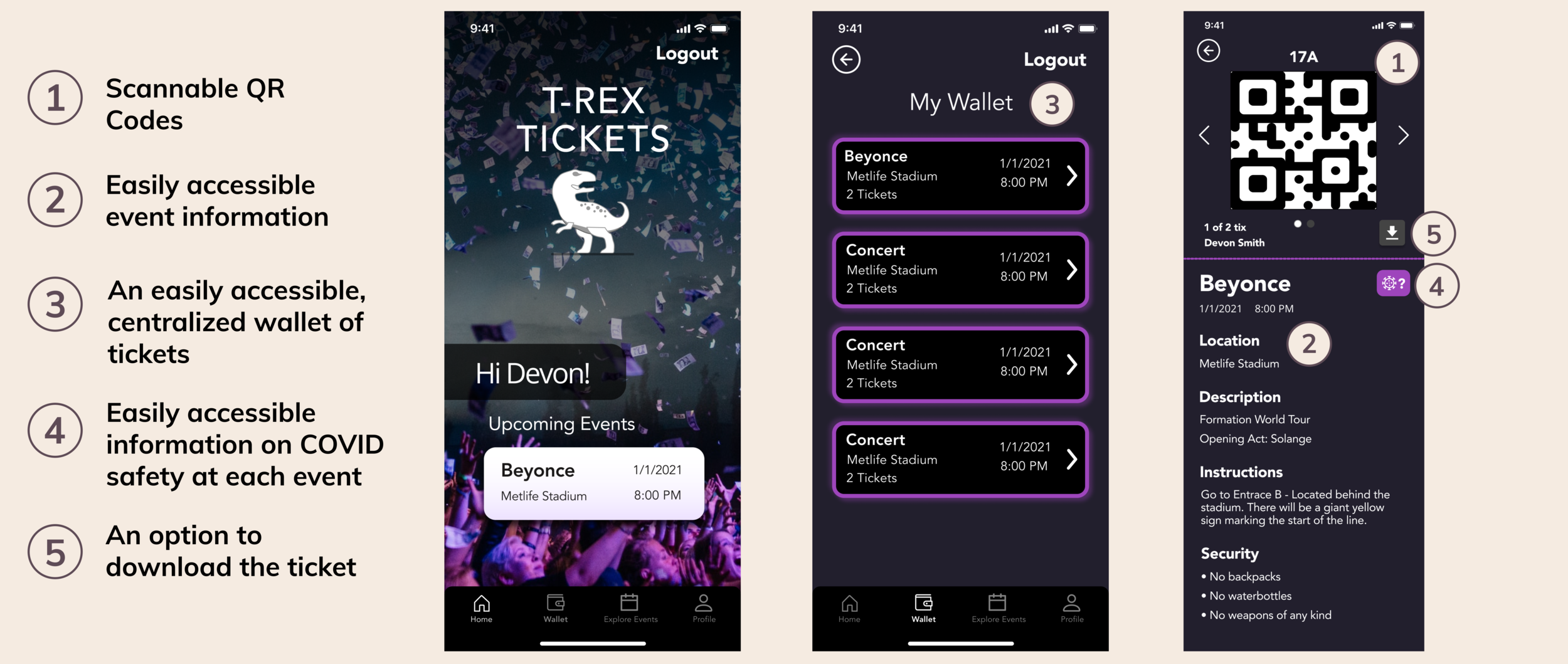
To guide our design process, the UX team listed out the high-level features that we believed would help solve Devon’s problems:
1. Scannable QR Codes
2. Easily accessible event information
3. An easily accessible, centralized wallet of tickets
4. Easily accessible information on COVID safety at each event
5. An option to download the ticket
We then met back up with the rest of our team and completed a design studio together. By including engineering and data science in the early design process, we ensured full team alignment, and profited from the combined creativity of more people who think about product design in different ways.
We took the time to freely ideate, sketch, and build off of each other’s solutions to create the basic skeleton for an app that would help Devon, would be usable, and was feasible to implement.
Low-Fi Sketches

The full team now had a solid idea of what this app would look like and how it would function. Engineering was able to get started building the app’s basic structure, while UX moved on to our next steps.
Due to our shortened timeline, and the fact that we were only building a few screens, we chose to skip the mid-fidelity phase of designing, and moved straight into creating high-fidelity wireframes based on our sketches.
We created a mobile prototype out of our wireframes to be used for usability testing, and to show the developers how we expected the flow and functionality of the app to work from a design perspective.
Phase 3: Implementation
Having built our design at a high-fi level, we handed it off to our developers to implement. Though we normally would have conducted usability testing before hand-off to validate our flow and make any necessary adjustments, we knew that the devs needed the high-fi designs as soon as possible in order to continue working. Luckily, we knew that we could make small changes to the final product after testing if necessary.
Through testing, we discovered a few flaws in the design, but none that were severe enough for us to include them in this iteration of the app. Instead, we recommended them for Next Steps, and left the implemented app in the same iteration as the prototype design.
Phase 4: Testing
Though we were working slightly out of order, the UX team still wanted to conduct a round of usability testing on our prototype. We hoped to learn whether or not the flow and basic layout of our app was intuitive, and whether or not users found the app useful. To get at these issues we came up with the following scenarios and tasks for our testing participants to complete:
1. You’ve just arrived at a Beyonce concert. Find out where to enter the event.

2. You’re curious about COVID safety at this event. Find out what precautions the event has in place to keep people safe.

Testing Results
- Find out where to enter the event: 5 / 5 users succeeded at accessing their ticket and finding the information on where to enter the venue
- Find out what precautions the event has in place to keep people safe: 5/5 users succeeded at clicking the “COVID” CTA to access safety information about the event

Key User Feedback
• 2/5 users were confused by the “Wallet” category in the navigation - they did not know where it would lead them
• 2/5 users found the COVID Information CTA confusing. Though they deduced what it was for, the iconography was not immediately intuitive to them.

Phase 5: Next Steps
Based on the results of our usability testing, we recommend adjusting the CTA microcopy to more intuitive language. “Wallet” should become “My Tickets,” and the COVID CTA should read “COVID Info,” rather than be represented by iconography.
- - -
Due to the highly condensed scope of this project, there were several steps the full team would have liked to explore, but did not have time to. Were this project to continue with a longer timeline, we also recommend the following steps:
- Convert this product to be a native app
Many users expressed fears about not being able to access their tickets when they arrived at events due to lack of internet. A native app would allow users to access their tickets within the app, even while offline.
- Ticket Transfer Feature
Though the facilitators of this hackathon asked that the product solutions not include a transfer feature, we found in our research that many users wanted to be able to transfer tickets to friends and family, or buyers if they had to resell a ticket. A feature that allowed users to make transfers without breaking any event rules would meet this need within the bounds of company policy.
- Explore Events Feature
Users currently struggle with the multi-step, multi-platform process of purchasing and storing a ticket for an event. By including a feature within the app through which users could browse and purchase tickets to upcoming events, we could further streamline and centralize the ticketing process.